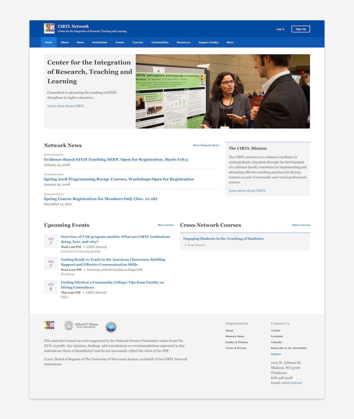
CIRTL Network
Sixth Edge had the opportunity to work with the Center for the Integration of Research, Teaching, and Learning (CIRTL) through a grant awarded by the Alfred P. Sloan Foundation to build a platform for a network of 25 Universities around North America. The platform provided a place to share resources, create learning communities, and offer courses to current and future STEM faculty committed to advancing evidence-based teaching practices. Since the initial grant, the Network has expanded to more than 40 research universities.
Background
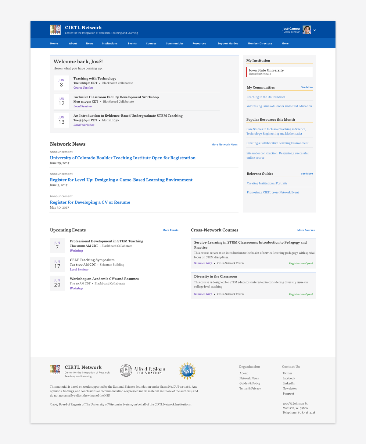
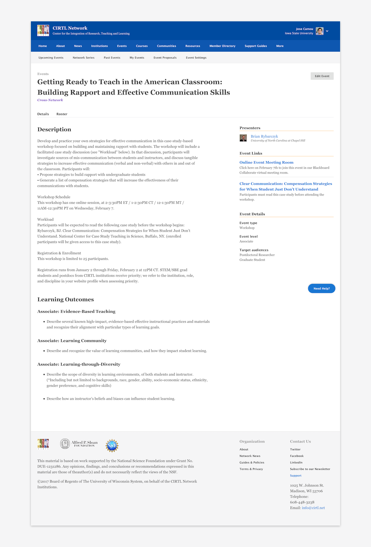
We’ve continued to work with CIRTL to provide development and UX support even after the end of the initial grant project. In May of 2017, there was a concern that the traffic around the resources section of the website was lower than expected. In December 2017 we deployed a significant redesign of the site to address this issue and to improve web accessibility around the platform. This case study will focus on that effort.
My Role
I was responsible for finding and testing a solution that would improve the user experience around the CIRTL resources. I was also responsible for updating current styles to enhance the mobile experience and enhance web accessibility.
Research
We conducted several meetings with the CIRTL Admin team to understand concerns based on tickets received via Intercom and their own experience using the website. From there I reached out to a few users who submitted an issue related to the resources.
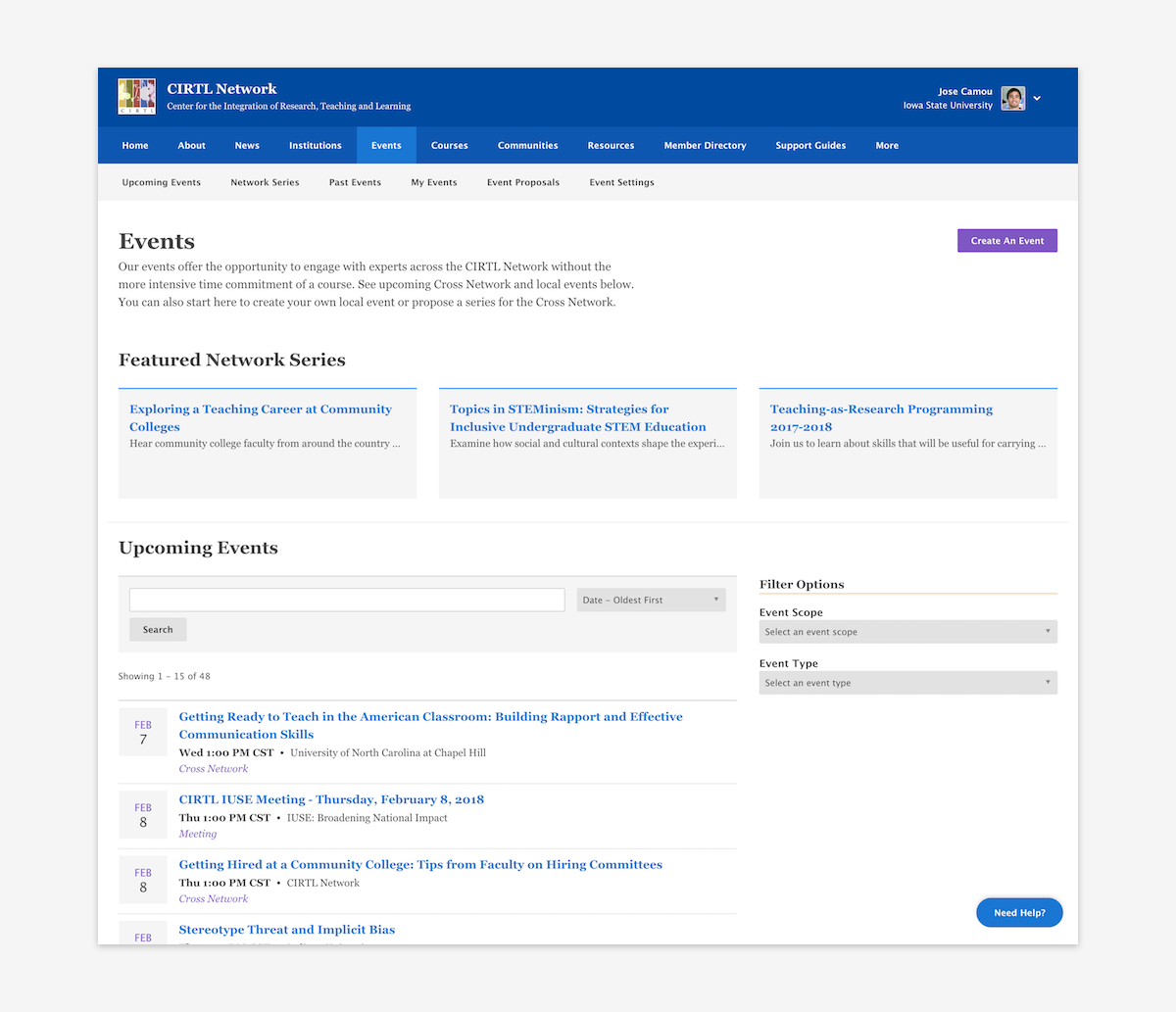
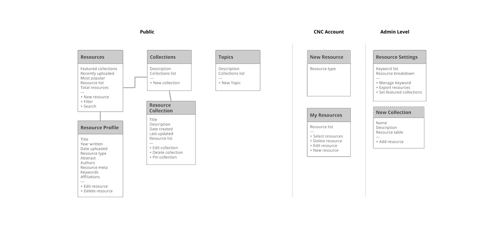
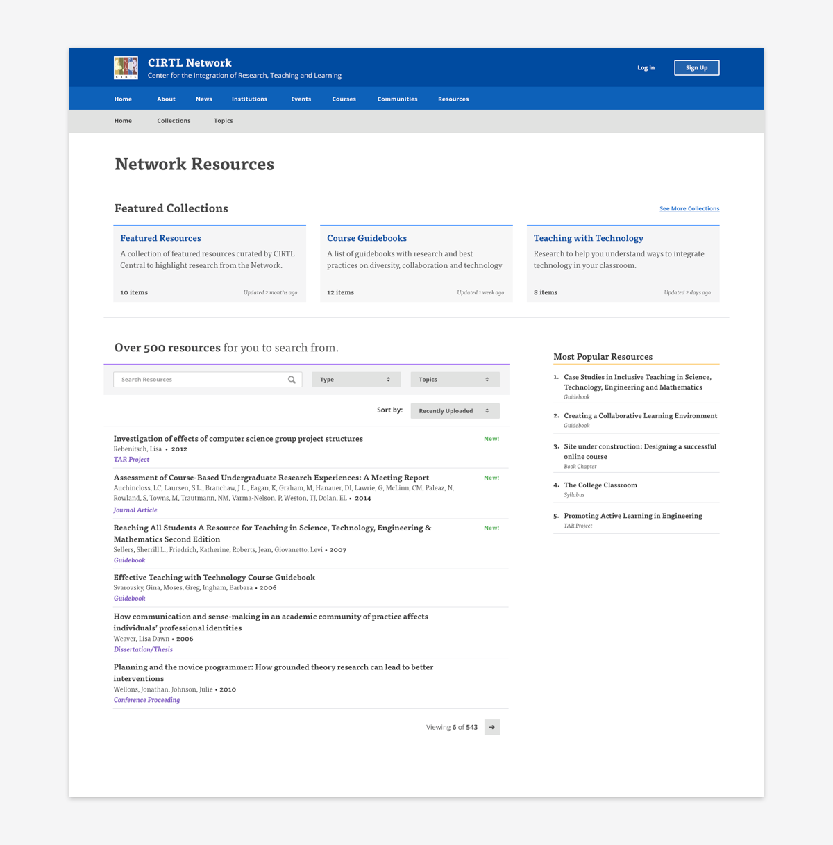
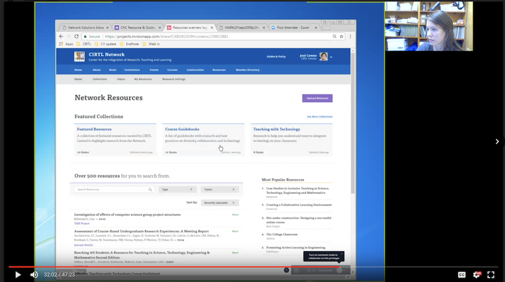
Based on the research we found that the resource section did not give users enough direction or incentive to explore. Users were only using resources when they knew exactly what they needed. So we decided to test the concept of “Resource Collections” where the CIRTL Admin team could group resources into a named collection and see if that provided enough incentive to stick around and explore the resources.
Once we had our hypothesis, I created a flowchart.
Sketching & Mockups
I started with some sketches to find a consistent layout that worked with all the different screens listed in the flowchart.
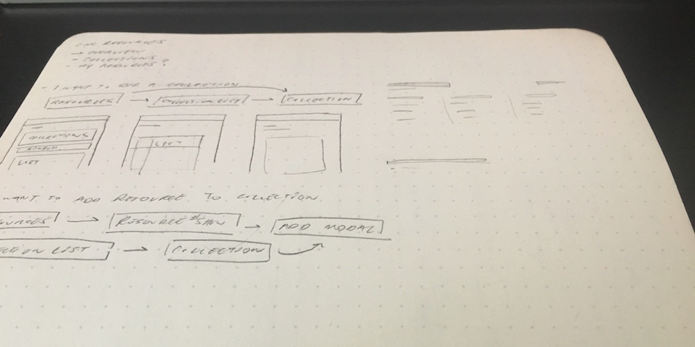
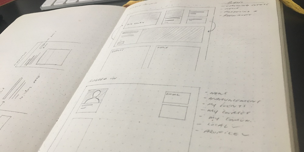
Once the sketching was done, I created mockups and added them to an InVision project to prepare for testing.
User Testing
Remote usability tests were conducted with current CIRTL users to compare the current version of the resources, at the time, and the new mockups.
As predicted, when given an exploratory task participant spent more time clicking through collections, one even writing down the name of a resource she came across in a collection.
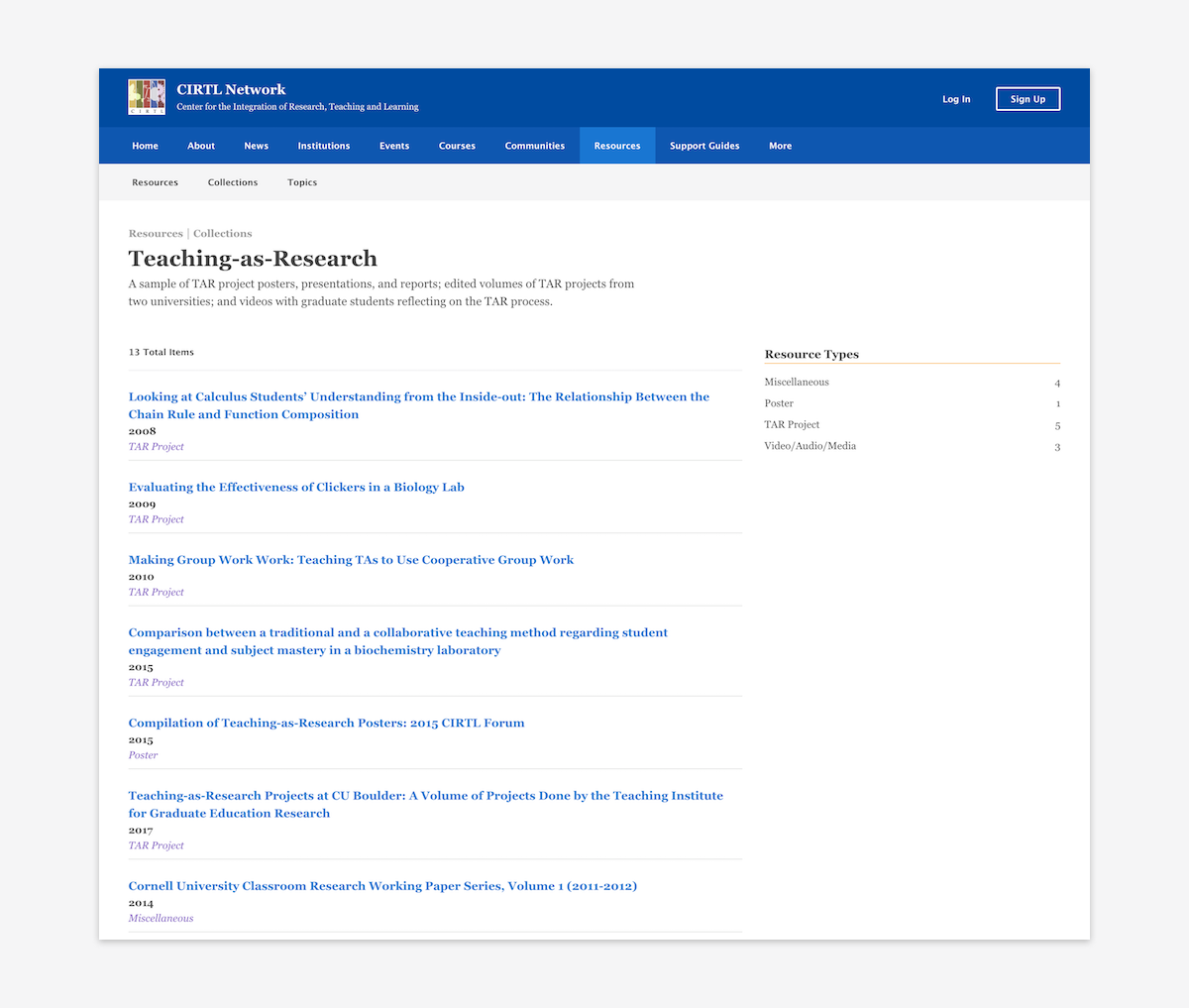
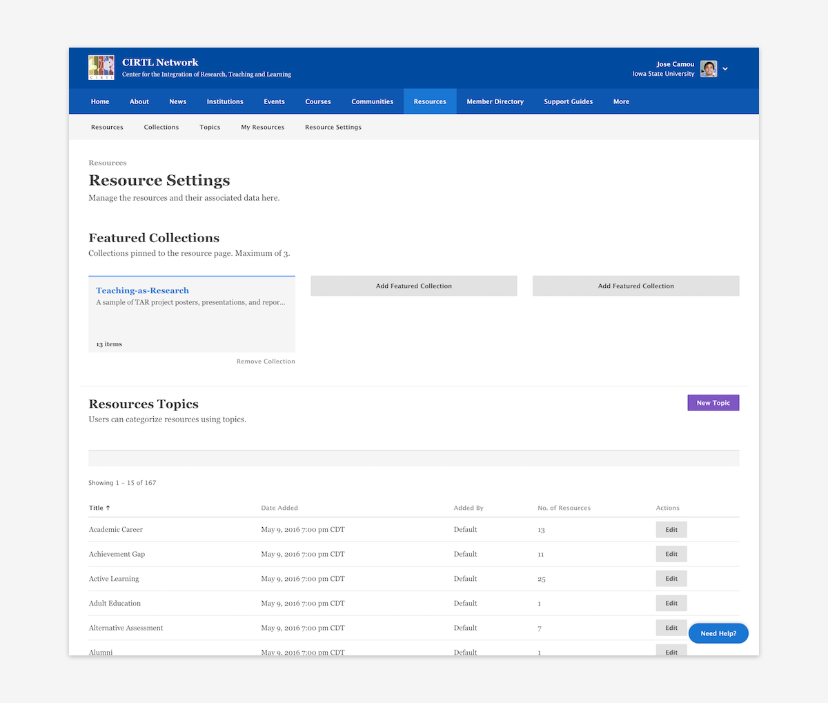
Resource collections were shipped in December 2017 and are currently in use on CIRTL.net.
Highlight
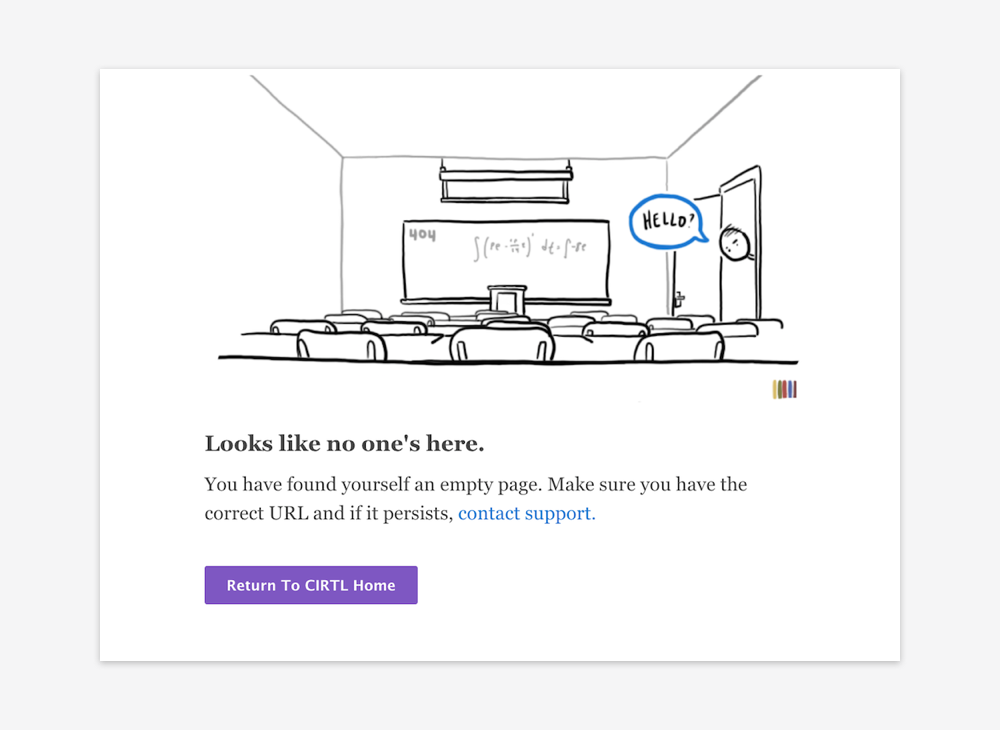
One of my favorite pieces from this project that is hopefully rarely seen is the 404 page. I wanted to capture that feeling of walking into the wrong classroom when you accidentally take a wrong turn on the website.